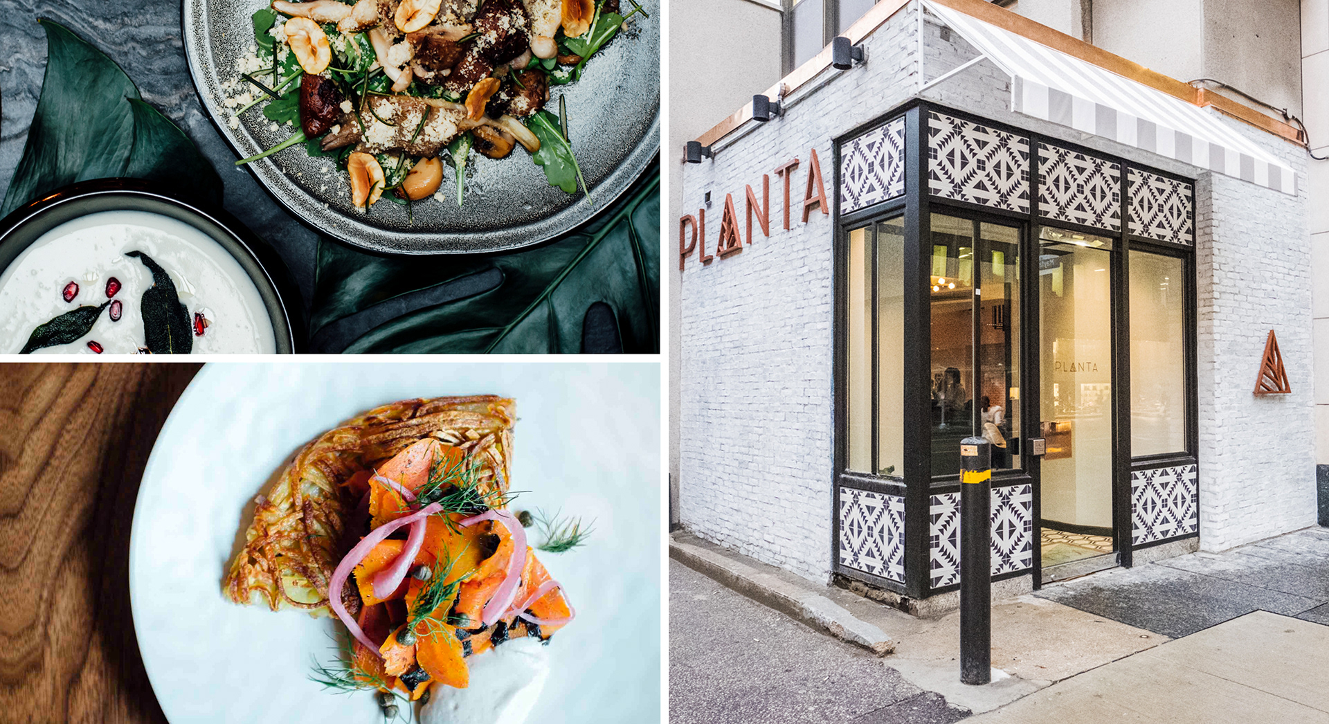
The logo aims to reinforce both the process and brand identity of Planta—through the juxtaposition of the straight lines of the triangle vs. the natural curved lines that appear in the veins of a leaf.
The way the natural lines are framed within the shape of the letter captures both the process of carefully preparing and presenting the natural (leaves, plants, etc.), and it also highlights and emphasizes the identity of the brand, ie. polished, carefully curated, exceptional, and “more than just natural”